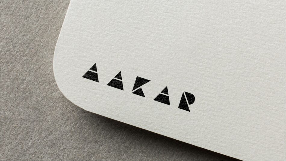
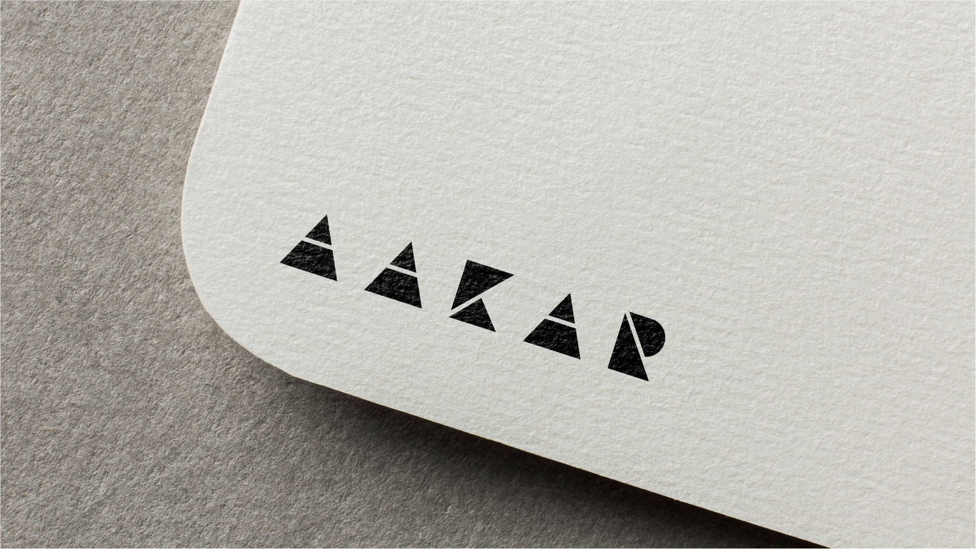
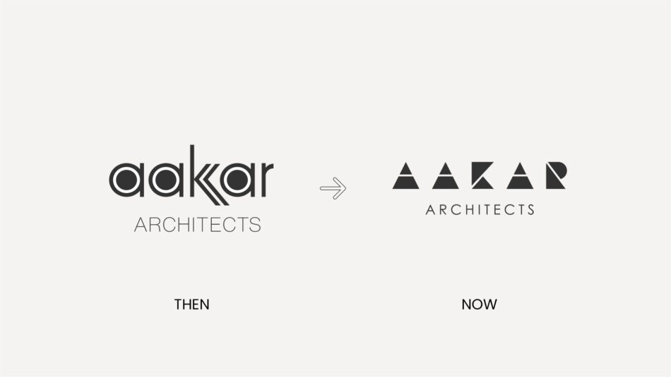
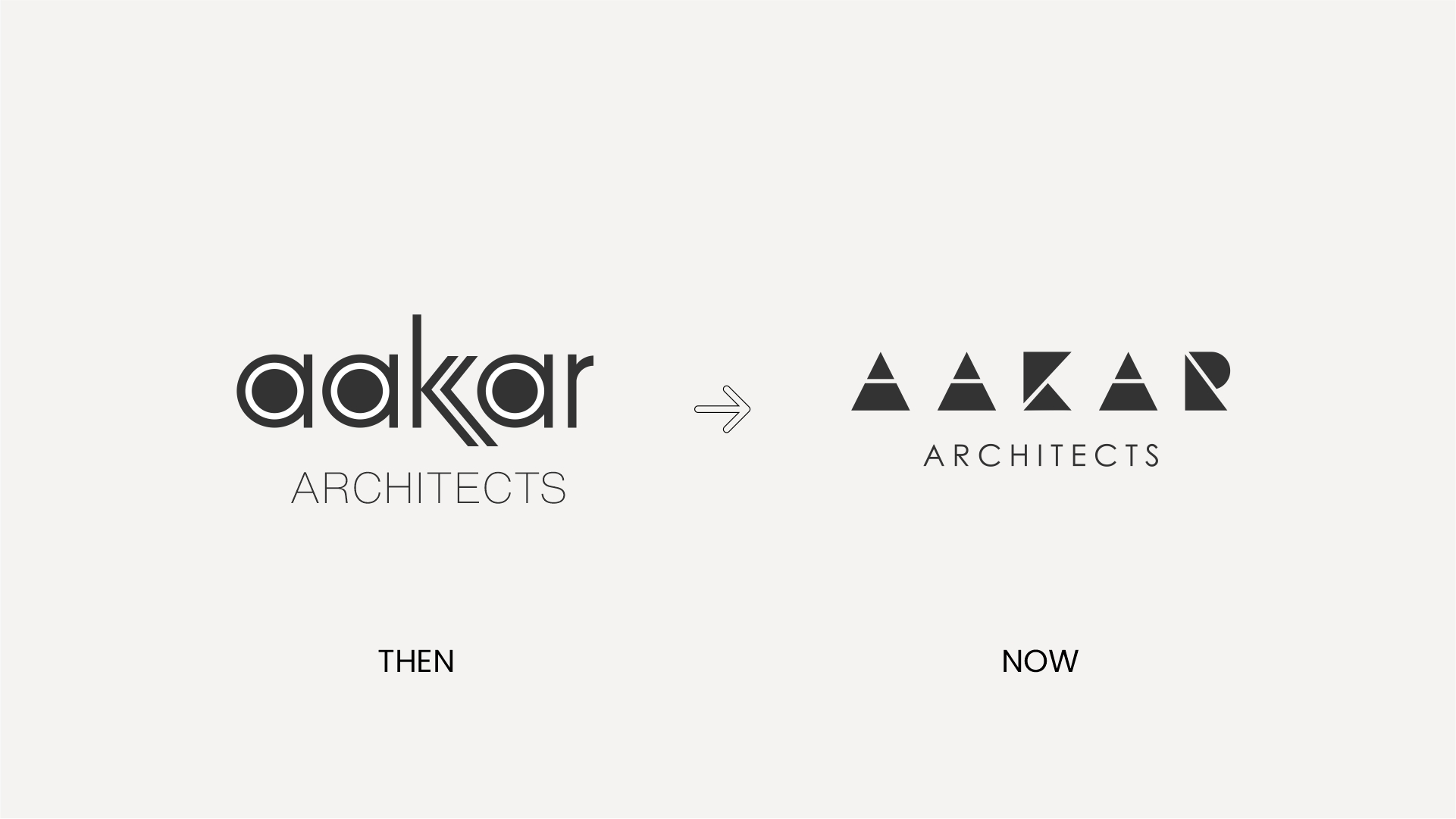
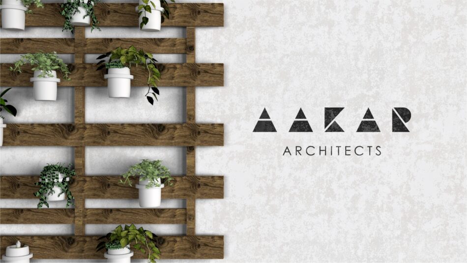
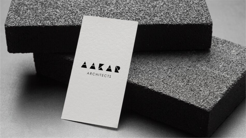
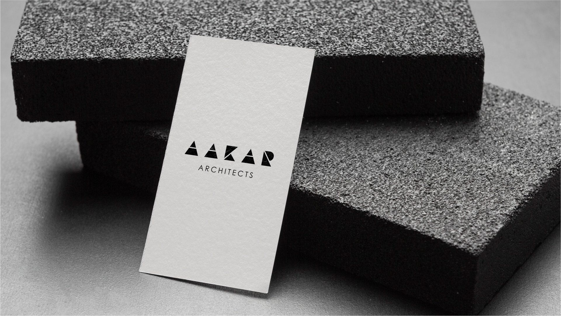
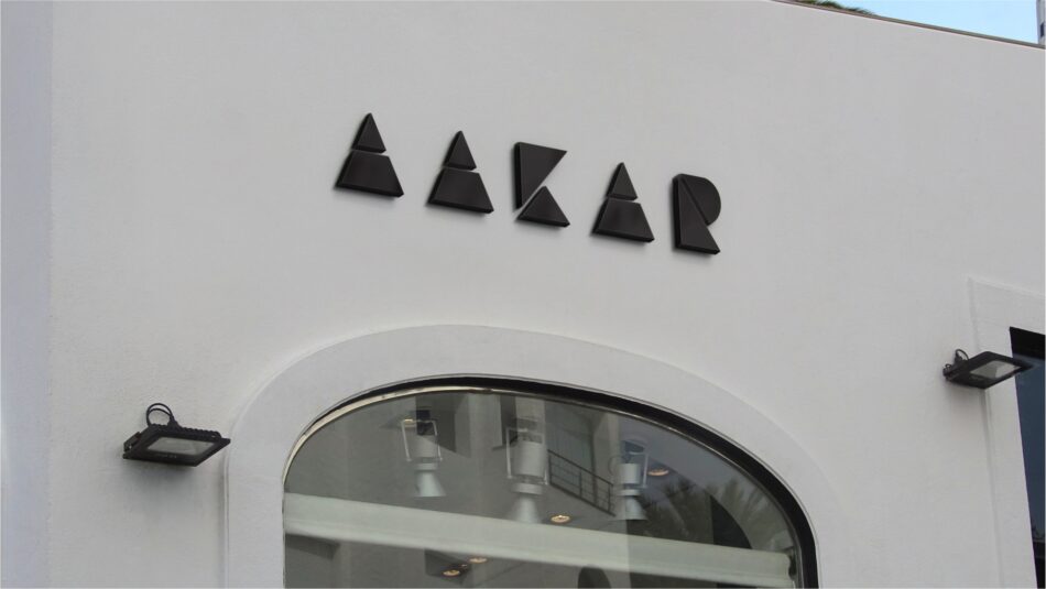
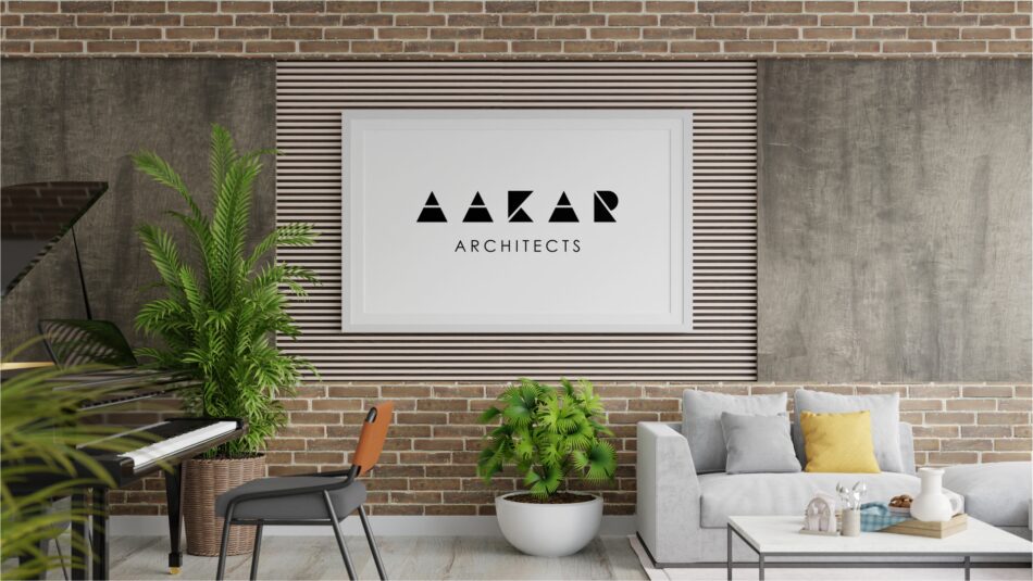
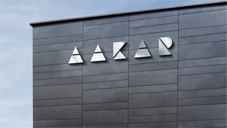
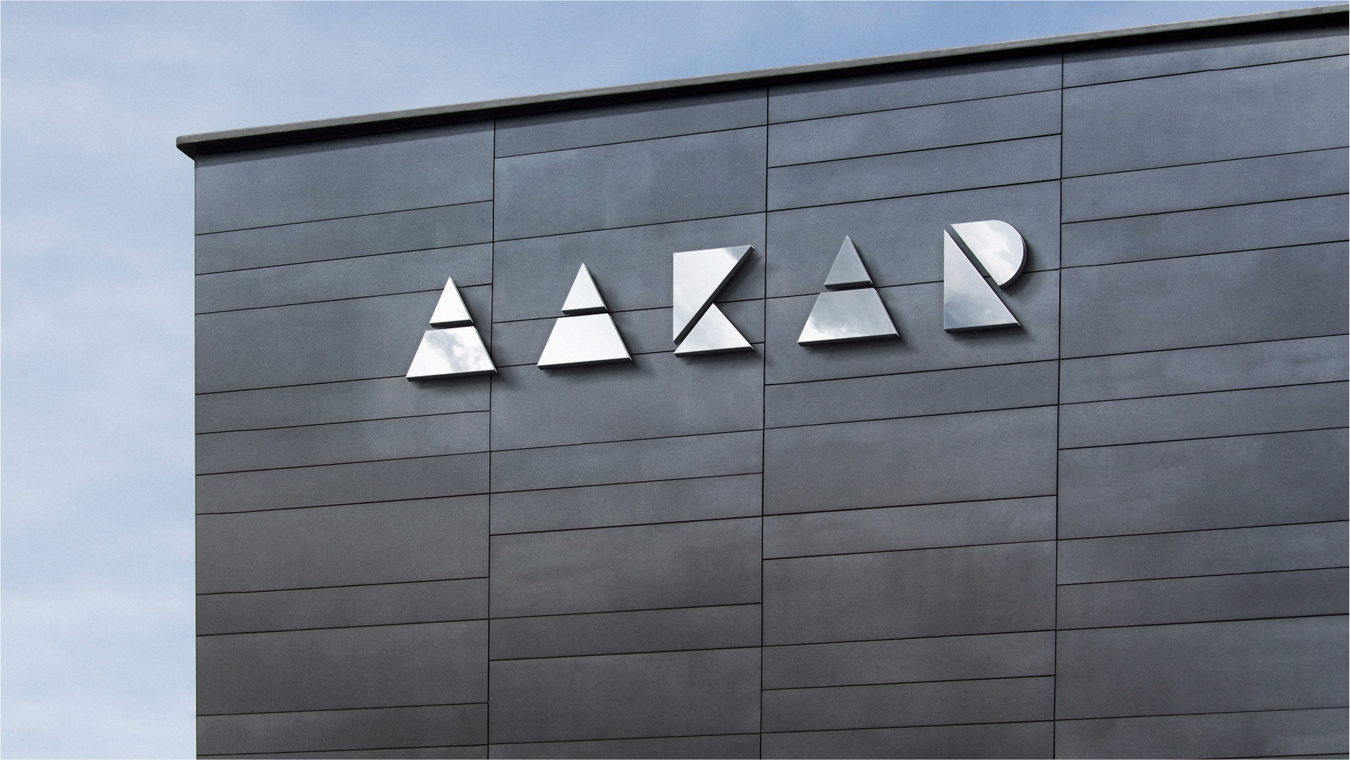
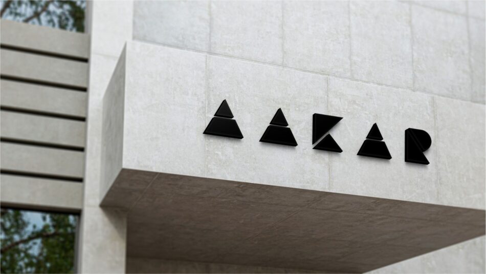
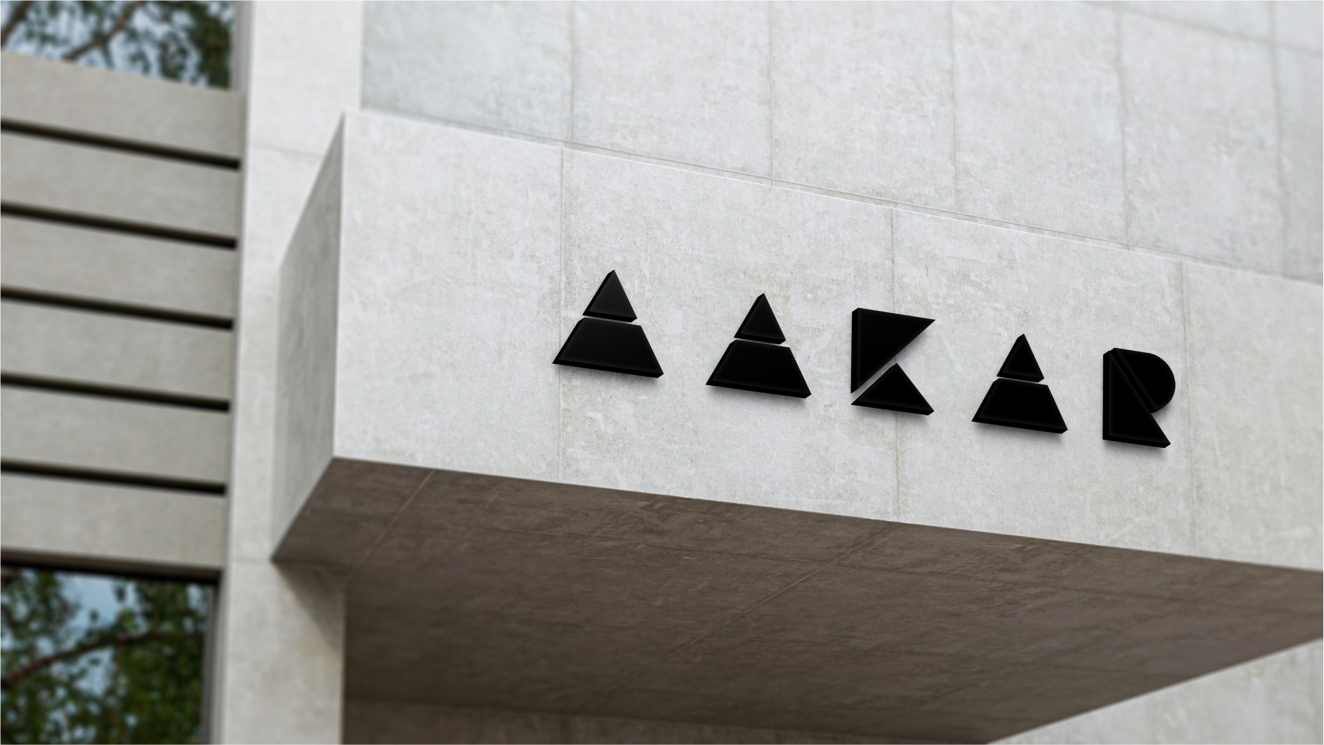
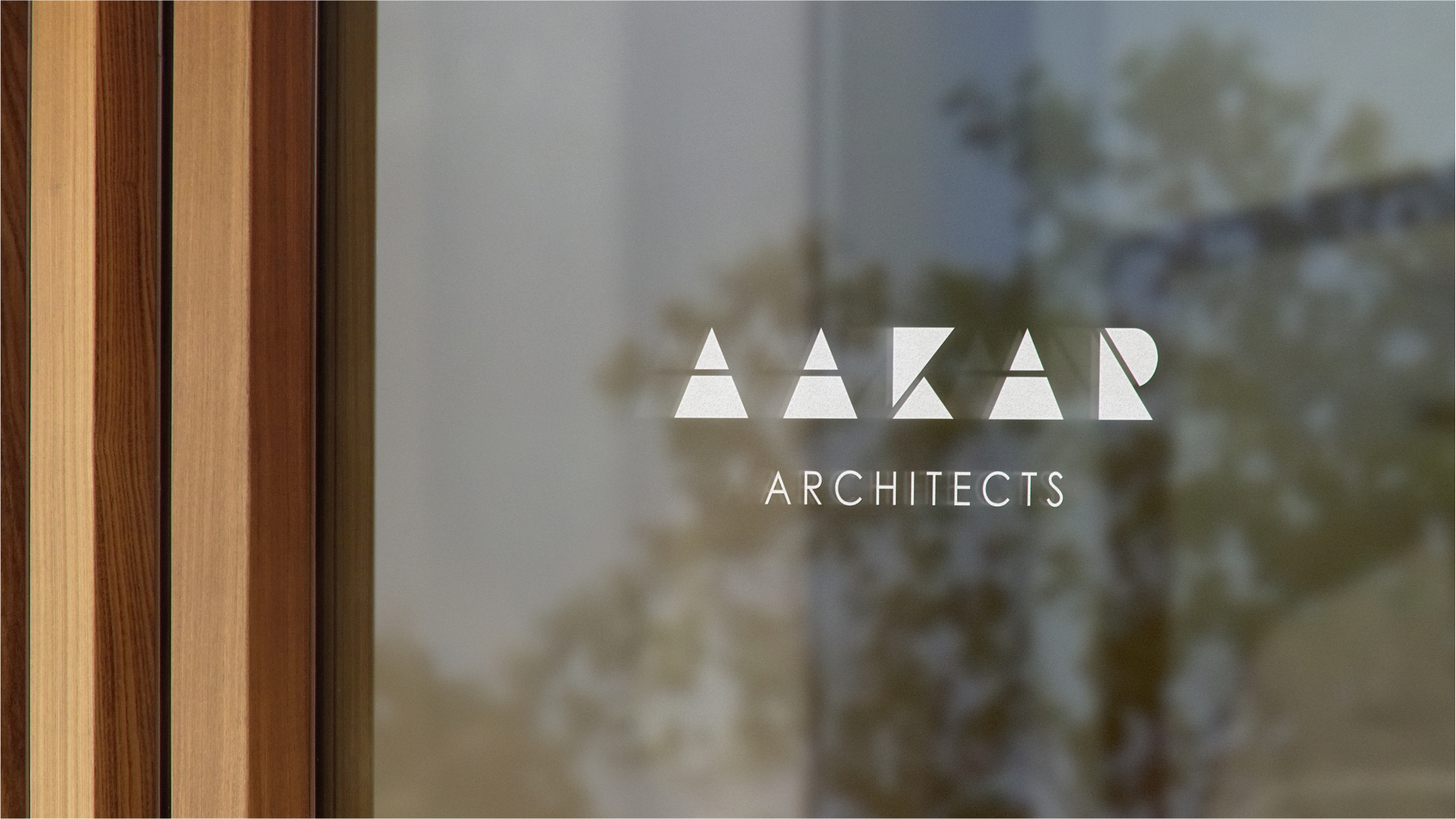
Concept Behind the Identity Design :
The rebranding of Aakar Architects' identity was inspired by the fundamental geometric principles that define architecture. The new logo deconstructs the word "AAKAR" into simple geometric shapes, symbolizing the firm’s structured and modern approach to design. Each letter is crafted using basic architectural elements, such as triangles, rectangles, and semi-circles, representing precision, balance and creativity.
Design Evolution :
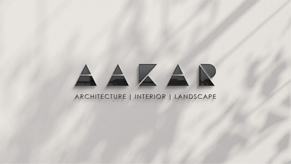
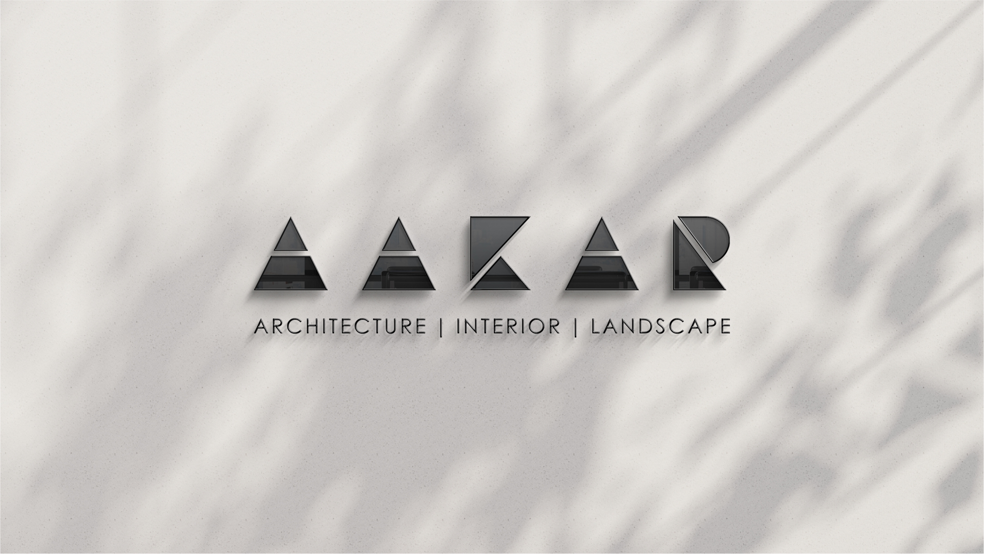
• The previous logo had a fluid, typographic style, which was transformed into a bold, minimal, and structured identity.
• The use of geometric forms reflects the firm’s architectural philosophy, emphasizing structure, stability, and innovation.
• A monochromatic palette ensures a timeless and sophisticated visual identity, reinforcing the firm’s professionalism and modernity.
• This transformation not only modernizes Aakar Architects' brand but also establishes a strong visual identity that resonates with its architectural vision.